Your ad got the click. Your landing page kept their attention. And then — nothing. No booking. No call. Just a visitor who arrived, looked around, and left.
This is the most common and most misdiagnosed problem in healthcare marketing. Most clinics respond by improving the ad, rewriting the landing page, or increasing the budget. But the drop-off isn’t happening in the ad or on the landing page. It’s happening in the journey between intention and action — and that journey is governed by psychology, not design.
The patient who doesn’t book isn’t uninterested. They are interested — and then something in the process introduces enough friction, uncertainty, or cognitive load that stopping feels easier than continuing.
Nudge theory, developed by Nobel laureate Richard Thaler and Cass Sunstein, provides the framework for understanding exactly where that happens and how to fix it.
This is a different problem from not saying the right thing in your ads. That is a messaging problem, addressed by loss aversion framing and behavioral copywriting. This is an architecture problem — the way your patient journey is structured either helps the brain complete the action or gives it reasons to stop. Nudge theory fixes the architecture.
What Nudge Theory Actually Means for Healthcare Marketing
Technical Definition: A nudge is any aspect of the choice architecture that alters people’s behaviour in a predictable way without forbidding any options or significantly changing their economic incentives.
In plain language: A nudge is a small change in how a choice is presented that makes it easier for people to take an action—without forcing them or offering rewards to make them do it.
Thaler and Sunstein’s most famous example is the organ donor opt-in versus opt-out system. Countries with opt-out systems (where you are a donor unless you specifically decline) have dramatically higher donation rates than opt-in countries — not because people in those countries care more about donation, but because the default choice is different. The nudge is the default. The outcome is massively different.
In healthcare marketing, the same principle applies at every touch point in your patient journey. The default option on your booking form, the way your CTA button is labelled, the presence or absence of a progress indicator, the language in your confirmation message — every one of these is an architectural choice that nudges your patient toward or away from completing the booking.
Why healthcare patients are especially susceptible to friction?
In most industries, a buyer who encounters friction simply tries again later or goes to a competitor.
In healthcare, friction has a unique effect: it provides the anxious brain with a reason to interpret delay as safety.
‘This is complicated — maybe I should wait until I have more time to think about it’ is exactly the cognitive out that a health-anxious patient is looking for.
This means friction in a healthcare booking flow does not just slow down conversion. It actively feeds the avoidance behaviour that was already present. Every extra form field, every unexplained step, every moment of uncertainty about what happens next is not a neutral inconvenience — it is a behavioral exit ramp that your patient’s anxiety will use.
The patient who doesn’t book isn’t saying no. They’re saying ‘not right now’ — and every friction point in your journey makes ‘not right now’ feel like the rational choice. Nudge theory removes those exit ramps one by one.
The Five Places Friction Kills Your Bookings
Friction in a healthcare patient journey does not announce itself. It operates quietly — as a slightly confusing CTA, a form that asks for too much too soon, a confirmation message that raises doubts rather than settling them. Here are the five most common friction points and the nudge that removes each one.
Friction point 1: The vague call to action
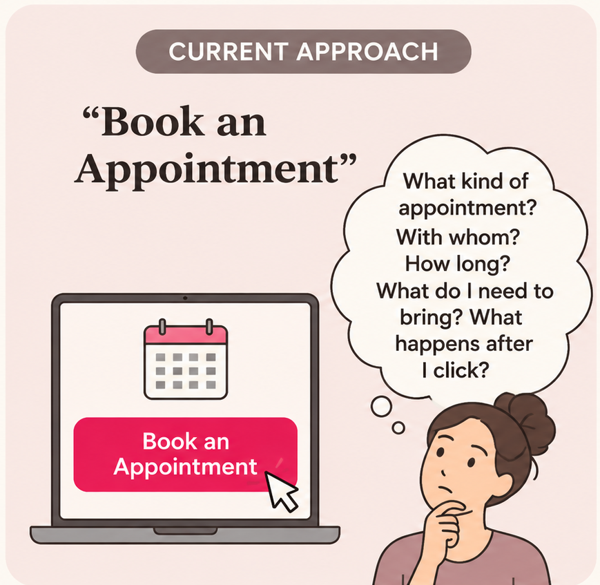
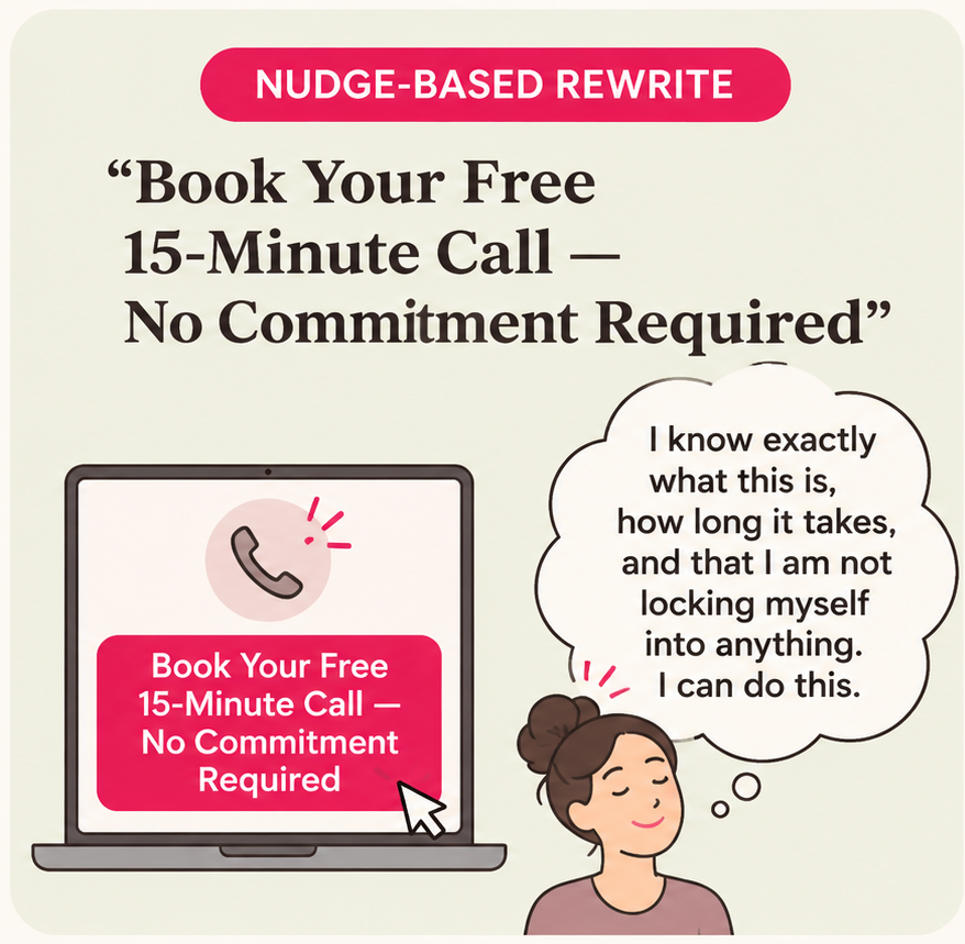
‘Contact us.’ ‘Get started.’ ‘Learn more.’ These CTAs are neutral — which means they are useless. A neutral CTA gives the anxious brain nothing to hold onto. It does not tell the patient what happens next, how long it will take, or what they are committing to. In the absence of that information, the brain defaults to caution.
Friction point 2: The over-long booking form
The standard healthcare intake form was designed for administrative completeness, not for conversion. Name, date of birth, address, insurance details, GP referral number, presenting complaint, medical history, emergency contact — all before the patient has spoken to anyone. From a behavioral perspective, this is catastrophic.
The commitment and consistency principle tells us that people are more likely to complete a process after they have taken a small first step. A long form asks for full commitment before any relationship has been established. The behavioral fix is to stage the information gathering: collect the minimum required to confirm the booking first, and gather additional clinical information after the appointment is secured.
| Form Type | Fields Required | Typical Industry Completion Rate |
|---|---|---|
| Full clinical intake form | 8–12 fields including medical history | Somewhere around 22–31% |
| Staged form — Step 1 only | 3 fields: name, phone, preferred time | Somewhere around 58–71% |
| Staged form — Step 2 (post-confirmation) | Clinical details collected after booking confirmed | Around 94% completion rate observed |
Friction point 3: The missing progress indicator
Uncertainty about how much further there is to go is one of the most powerful sources of abandonment in any multi-step process.
In a healthcare booking flow, this uncertainty is amplified by anxiety — a patient who does not know if they are on step 2 of 3 or step 2 of 9 will often stop rather than risk committing to an unknown amount of time and information.
A progress indicator — even a simple ‘Step 2 of 3’ or a visual progress bar — changes this calculation entirely.
It tells the patient that the end is near, which makes finishing feel easier than stopping. A physiotherapy group added a three-step progress indicator to their booking flow with no other changes. Booking completion increased by 31% within the first month.
The nudge is visibility. Show people how far they have come and how little is left. The brain responds to proximity to completion — it is wired to finish things it has started. A progress indicator activates that wiring.
Friction point 4: The anxiety-inducing confirmation message
Most healthcare booking confirmation messages are administrative: ‘Your appointment has been booked for Tuesday 14th at 2pm. Please bring your insurance card and arrive 10 minutes early. If you need to cancel, please give 24 hours notice.’ This is accurate. It is also behaviorally counterproductive.
A patient who has just made an anxious decision does not need to be immediately confronted with the logistics of cancellation. They need their decision reinforced. The confirmation message is one of the most overlooked behavioral touchpoints in the entire patient journey — it arrives at the exact moment of maximum commitment and either strengthens that commitment or introduces doubt.
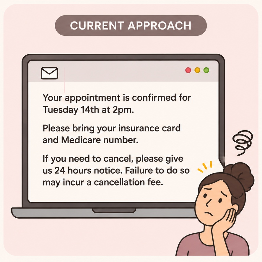
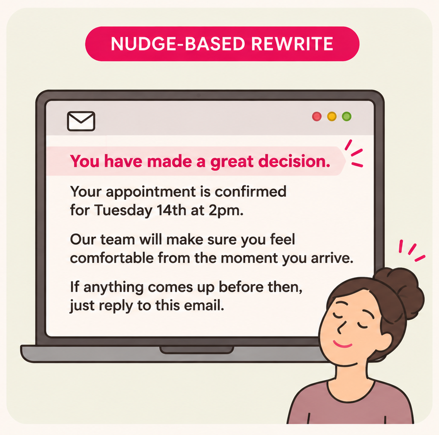
The nudge is reinforcement. Validate the decision, set a warm expectation, and make follow-up feel easy. The cancellation policy can be in a separate paragraph further down — present but not leading.
Friction point 5: The gap between booking and appointment
The period between booking confirmation and the appointment itself is where a significant proportion of no-shows are created.
In behavioral economics this is called the intention-action gap — the patient intended to attend when they booked, but the psychological distance between the moment of booking and the day of the appointment allows doubt, avoidance, and competing priorities to erode that intention.
Nudges in this gap are simple and highly effective. A reminder message 48 hours before the appointment that frames attendance as an act of self-protection rather than an obligation: ‘Your appointment is in two days. You took the step of booking — don’t let that step go to waste.’
A same-day reminder that reduces uncertainty: ‘Here is everything you need for today — parking, what to bring, who you will meet.’
Each of these is an architectural choice. None of them changes the appointment, the offer, or the price. They change the psychological context in which the patient makes the decision to attend or not.
Applying Nudge Theory Across Your Healthcare Marketing Stack
In your Facebook and Meta ads
Nudges in ads operate at the level of framing and default assumptions. The way you describe the next step — not just what to do but what it will feel like and what it commits the patient to — is a nudge.
An ad that says ‘Book a free call — takes less than 60 seconds’ is nudging the patient by reducing the perceived cost of the action. An ad that says ‘Join 340 patients who took this step last month’ is nudging through social default — ‘people like me do this.’
The single most impactful nudge available in a Facebook ad is the CTA button label. ‘Learn More’ is the weakest option available.
‘Book Free Call,’ ‘Get Your Assessment,’ or ‘Start Today’ all perform significantly better because they name a specific, low-commitment action rather than an undefined next step.
On your landing page
The landing page nudge environment is rich.
Above the fold: a specific, time-bounded CTA (‘Book your 20-minute assessment this week — limited appointments available’) combined with a trust signal (‘4.9 stars from 312 patients’). These two elements together nudge through loss aversion (limited availability) and social proof (others have already done this and rate it highly).
Below the fold: an FAQ section that anticipates and removes the specific fears most likely to prevent booking. ‘What happens in the first appointment?’ ‘Do I need a referral?’ ‘What if I need to reschedule?’ Each answer is a nudge — it removes an exit ramp before the patient reaches it.
What Good Nudges Look Like vs. What Manipulation Looks Like
Nudge theory is sometimes conflated with manipulation — and the distinction matters enormously in healthcare, where trust is the foundation of every patient relationship. You must know the distinction between an Ethical Nudge and Manipulation Tactic. Few examples:
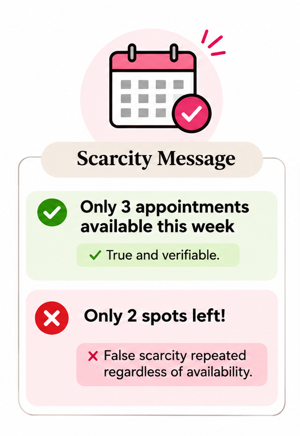
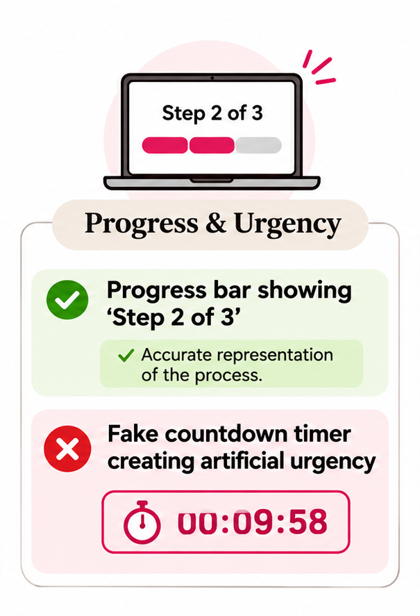
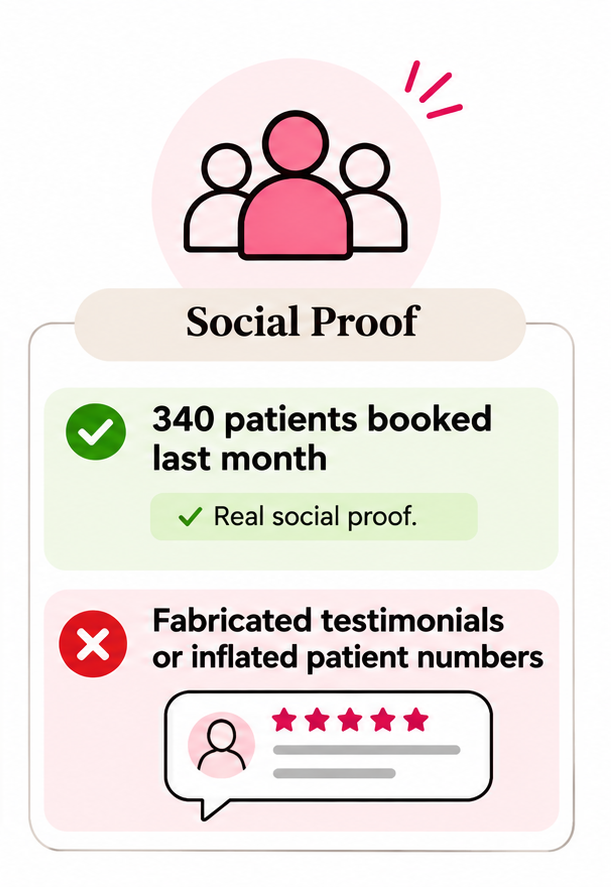
The practical test for any nudge in a healthcare context is the same as for any behavioral marketing tactic: would a licensed clinician be comfortable with this approach if they saw it applied to their own patients?
Ethical nudges make it easier for patients to do what is genuinely in their interest.
Manipulation makes it harder for them to protect themselves.
The line is clear.
The Final Thought
Your healthcare patients are not failing to book because they are not interested. They are failing to book because the journey between interest and action is filled with small architectural choices that make stopping feel easier than continuing.
Nudge theory does not change your offer. It does not change your pricing. It does not require a new ad campaign or a bigger budget. It requires a systematic look at every touchpoint in your patient journey — the CTA, the form, the progress indicators, the confirmation message, the reminder sequence — and a deliberate choice to make each one push gently in the direction of completion rather than abandonment.
The clicks are already there. Nudge theory turns them into bookings.
The five nudges in this article — specific CTAs, staged forms, progress indicators, reinforcing confirmation messages, and intention-gap reminders — require no additional budget and no new creative. They require only the understanding that your patient’s brain is not an obstacle to work around. It is the system you are designing for.
If you want to map the nudge opportunities across your specific healthcare patient journey, that is part of what the behavioral marketing research process at Market to Mind covers. You can also explore the full behavioral marketing playbook for healthcare to see how nudge theory fits alongside the other four behavioral levers.
About the Author: Jawahar Kaushal